This is my Adobe Illustrator and Photoshop program experiments
and learning outcomes.
Here are my hand drawn flats, scanned in for the collection I will present at the end of this project.
The Pinterest account link to support my research:

Knowing the basics of Photoshop, helped me to ease reduce the time spent on Adobe Illustrator. Below are the mesh up of all the unhidden layers in the Illustrator. I saved the image by copying it and pasting to PS and then saved as a JPEG format. But it only for work in progress demonstrating purposes. I was worrying with hidden layers. The turtle neck long sleeved dress is a template from WGSN website. I have reduced the opacity and added new layer on top of this, just like I've learned watching Lynda.com tutorials. Then using and experimenting with different tools created basic lines and curved them to the wanted lengths. I have come across very confusing situation, as I use Adobe CC not as many tutorials yet, and my pen tool wasn’t corresponding with me. I have decided then to update the software and the problems were gone. The updated brush was one of the main tools I used, after changing the fidelity to maximum. So here are few examples of my own flats in progress.
The pearl bead piece is imported from Photoshop, I have gained few new brushes and learned few basics of creating my own brush in Illustrator and it is very exciting for me, I have discovered new favourite program to work with. I think I do need allot more practicing and tutorial videos for more precise flat art work.

You can see from the screen dump below, the many layers and tools I've used and all the active paths. The purple one indicates the bead accessory being applied to the back of a short jacket. To almost every part of pieces including the accessory, I have used the mirroring tool, also used copy, rotate, align and few brushes just for interest.

Few extra Adobe Illustrator tutorials guided me into the typing adjustments and logo creations, so I have tried the very simple logo that I have used in my flats! Using the gradient tool and the touch type tool was very interesting and let me manipulate the letters and background the way I wanted. The touch type tool lets you change the each letter not looking that the text is one piece! Very interesting and innovative.
I am using the shorted version of my son’s name which is Naidonas to NAIDON as my future brand name and logos for now.
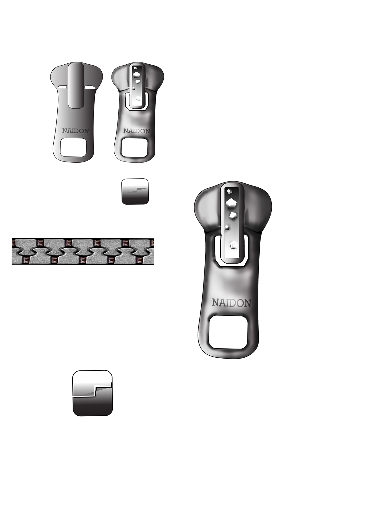
The pieces below is my created zip fronts and ends. The teeth part is uploaded from generous artists on the web.
I have traced the old looking zipper head shape and filled it with greys. The uploaded it to Photoshop and developed further, as the illustrator for me is still very new and I feel very confident PS so for the extra bit was really great to use both programs combined. I have used some more shapes and mark tool and gradient tool, the burn and dodge tools for creating depth and lights. Then I have isolated just few parts of the zipper and smudged it to look more realistic, using 100% smudge tool and was very pleased with the outcome. The tiny shapes looks like gems and this can and will be developed much further in future, with proper zipper feet and my own custom zippers. I have also watched a video about making a zipper brush and this is very easy and amazing. In my case something went wrong and I couldn’t use the beginning and end parts for creating the brush. But I did turn it into zipper head brush, just the size is hilarious and I need to develop it much further.
I did apply this to my flat drawings, but the size is not that big and it’s almost impossible to see the detail.

Here below is a part of my flats, including 4 garments with fronts and backs, and the first dress has two versions of backs for different jackets to match, or just for the taste of the consumer. I have added my logos were applicable and the new zip I've created with Illustrator and Photoshop. But these are minor elements and are not very clear in this JPEG format file. I like the way WGSN uses some shades and opacity reductions for some certain parts, so I decided to add the grey colour to make it more visible where is the outer part of the garment, and darken where the inner part is. Another tutorial taught me about the stroke feature that can be applied to the active path lines or can be used as a brush and this created perfect seam lines, with 2x2 length and spacing measurements. I mainly used the pen brush, but this new feature brush let me do some very fine but more wobbly lines for the extra curves. I think I have done a great job as a first time user of Adobe illustrator. I did use Ps for colour filling and some minor mistake fixing. I really like the mirror feature in Illustrator but can easily get the same results with PS by select copy and paste, it does take a bit more time and I am sure I still don't know about easier ways of doing this.

Flats drawings with specifications, using Photoshop.

This is the template from WGSN and it is pinned in my Pinterest account.

Another template usage from WGSN of a dress.
This was more tricky and complicated as the design itself is more difficult. The illusion fabric only marked by the stitch lines, the front applique in black and the reduced opacity applique at the back for more distant look. I did do to some trouble while trying to change few lines, the other active lines kept changing too and I realised that my objects should have been drawn less conjoined, so the movement wouldn’t affect the rest of the outfit. But after working and reworking this flat I think the outcome is quite a good standard for a beginner. In future I will consume few more tutorials and experiment more complicated and advanced techniques on the Adobe Illustrator.
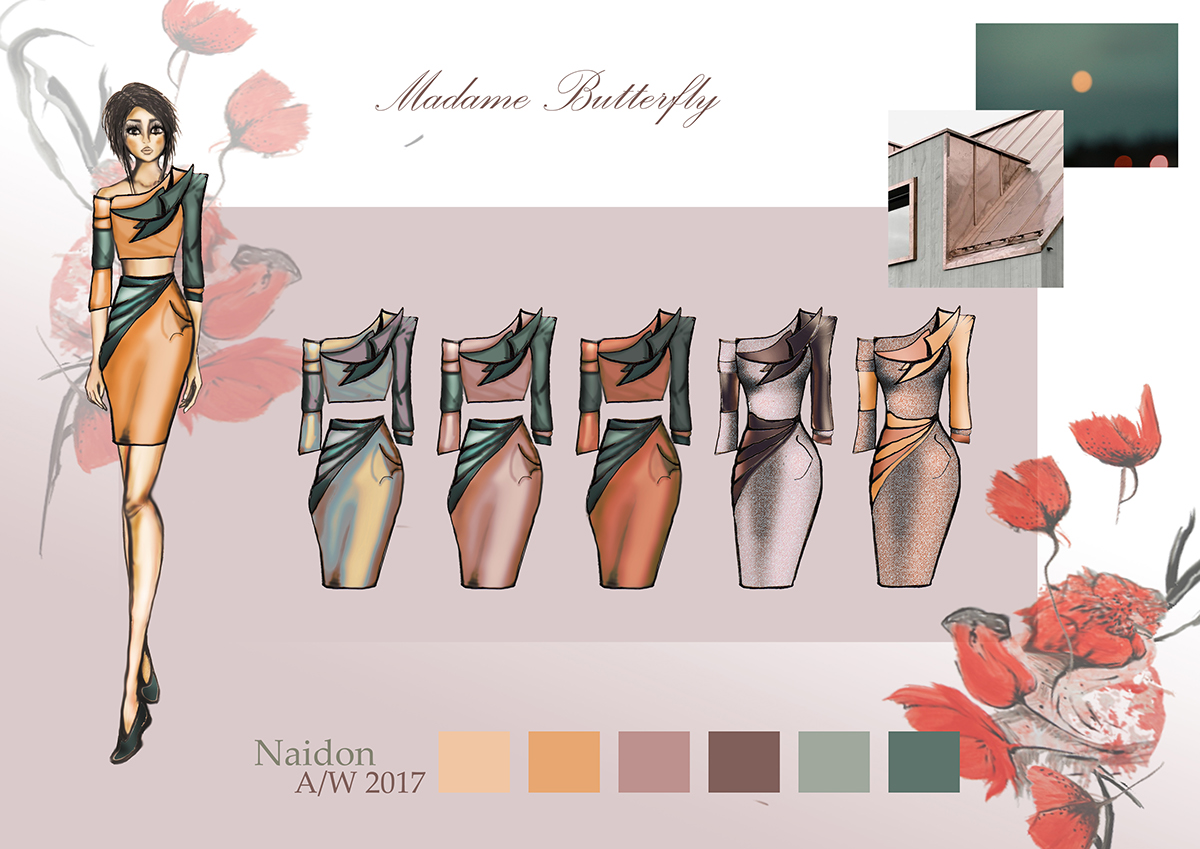
My final sketches of the dress inspired by my Madame Butterfly costume, research and upcoming trends.

The mood boards for my collection
This is the Ballynahinch, Belfast and London picture collaboration, that I took using Samsung NX3000 camera and using the sunset mode.
I love color combination and tone in these images also the mood is very soothing and collaborates with cold seasons A/W. This was combined using Photoshop with no alternative adjustments, these are the raw images. I had to apply the changes as I haves saved this work in CMYK format and Behance asks to use RGB mode, something small but new lesson learned.
Please see my Pinterest board with secondary and primary research images of upcoming color trends for A/W 16/17
It contains references to the secondary images used and my secondary visual color trend research from WGSN and Pinterest. Also nature itself when it comes to my primary photography.

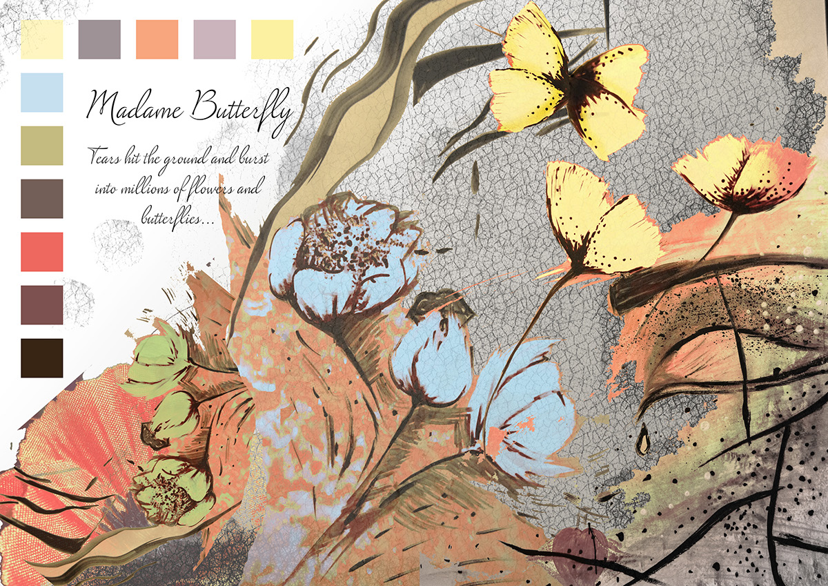
This might look like S/S mood board, with its light tones and flowers, but in fact this is the A/W mood board for the print and applique part of the garments. These images are drawn by me using watercolour paint and manipulated on Photoshop using many different tools. I have also loaded a new crackle effect brush and used it on some parts.
But again why is this image Autumn/Winter? Well, the tears and sadness of Madame Butterfly represents autumn rain, her death in the Opera story represents winter, like when the flora and fauna dies or goes to hibernate. But the beauty of love and feelings is eternal and should always be celebrated no matter what the season. These two seasons needs a hint of life on top of bold and dark colours. I think my collection represents very beautiful and on demand colour combinations and tells a good visual story.
All content is hand drawn by me including my own body template and background images. Then it is uploaded to Illustrator to trace and smoothen the lines and brought back to PS for the advanced manipulation. These are the jackets to represent the flat drawings above.
The pieces are inspired by my visual research for Madame Butterfly costume making and my own costume. The wrapping hint, the poppy applique and the cornered shapes.

Another story board of my collection. This one includes the matching dress type of a suit and the united version of it. The very corner image on the right is my own, the one below is from WGSN colour trend forecast for A/W 16/17
Again like every other piece, these garment images were sketched in black ink pen only, scanned, uploaded to Adobe Illustrator and build up on Photoshop. The collaboration of these two programs is a perfect solution for a fashion designer and once the basic are learned it is easy to use. I didn't have any difficulties with PS the main problem was just sorting everything and getting the layers in order.
I love how the nature dictates an incredible colour combinations to us all we have to do is capture it and make the world to see it from another perspective.
Very beautiful fashion presentation and a story board. All primary images and allot of work, was struggling with a black dress, it is a bit tricky to make a black piece of clothing stand out, this is why the lighter shade of black is used instead and this can be dodged for shading. I have also used the pattern tools for texture or print for the other pieces in collection that I will present in the book together with my trend report. Adobe Illustrator image trace - default and Photoshop afterwards.


